
Safe Bitez
Empowering users with dietary restrictions navigate grocery aisles with confidence


Mobile first website
Type
1 month
Timeline
UX/UI Design, UX Research, Wireframing, Prototyping, User Testing
Skills
OVERVIEW
What is Safe Bitez?
Safe Bitez is a label scanner app that aims to alleviate stress and disorganization for shoppers with dietary restrictions. Within seconds users can figure out whether or not a food product is safe to eat for themselves or a loved one, find alternatives, and save their favorite snacks for future reference.

THE PROBLEM
Navigating hundreds of food options while having a dietary restriction can be overwhelming
Especially when a dietary restriction or food allergy is life threatening. This is the reality for 32 million people in the United States. Reading food labels with dozens of confusing ingredients, finding alternatives, and keeping track of safe foods can be cumbersome.
THE SOLUTION
Lessen the time, stress, and disorganization for food sensitive shoppers
Food is a huge source of enjoyment for so many people. Just because one has a food allergy or dietary restriction doesn’t mean that they should miss out on their favorite foods when grocery shopping.

Ensure food safety for the whole household
Create a profile for not only yourself, but a loved one as well
Input your specific dietary needs and the scanner will take care of the rest
Save time when grocery shopping
Use label scanner to see if a food product is safe to eat in seconds
Find alternatives to your food favorites with just a couple clicks
Read reviews of alternatives

Keep your favorite foods organized
Save your safe food favorites for future reference
Create customizable categories by naming it and selecting who in the household the category is for
THE PROCESS
Let’s dive into the details
Thanks for sticking around, now let’s get into my process. How did I arrive at my solution? What were my research findings? What did I learn along the way?
HYPOTHESIS
Guaranteed food safety for shoppers will reduce time, stress, and disarray
Before interviews, I believed users prioritized a smooth, stress-free shopping experience for themselves regarding their own food intolerances and allergies. However, after talking with users, I found many are more focused on efficiently finding safe food products for their loved ones with allergies and intolerances.
WHITE PAPER RESEARCH
Food allergies and intolerances is a household problem
Before diving into my competitive analysis, I wanted to start off on the right foot by exploring beneath the surface.
If both parents have an allergy, the child's likelihood of having one too rises to 60%-80%.
It was also found that if one parent has an allergy, the child’s likelihood of having one too is around 30%-50%.
Source: Medical Xpress1 in 13 children have a food allergy or intolerance. Of those children, 40% have had a severe reaction.

Also, only a handful of food and food additives cause 90% of all allergies.
Source: Loyola MedicineCOMPETITIVE ANALYSIS
Lack of seamless profile creation for a loved one presented an exciting opportunity
Although each app had its advantages, the evaluation of these four apps unearthed a shared gap in the user experience; none provided a reliable scanner with unlimited scans alongside the essential feature of creating profiles for loved ones.
Fig was unique in considering loved ones' dietary restrictions. Yet, to share profiles, users had to share login details which would be impractical for a mother shopping for her child.
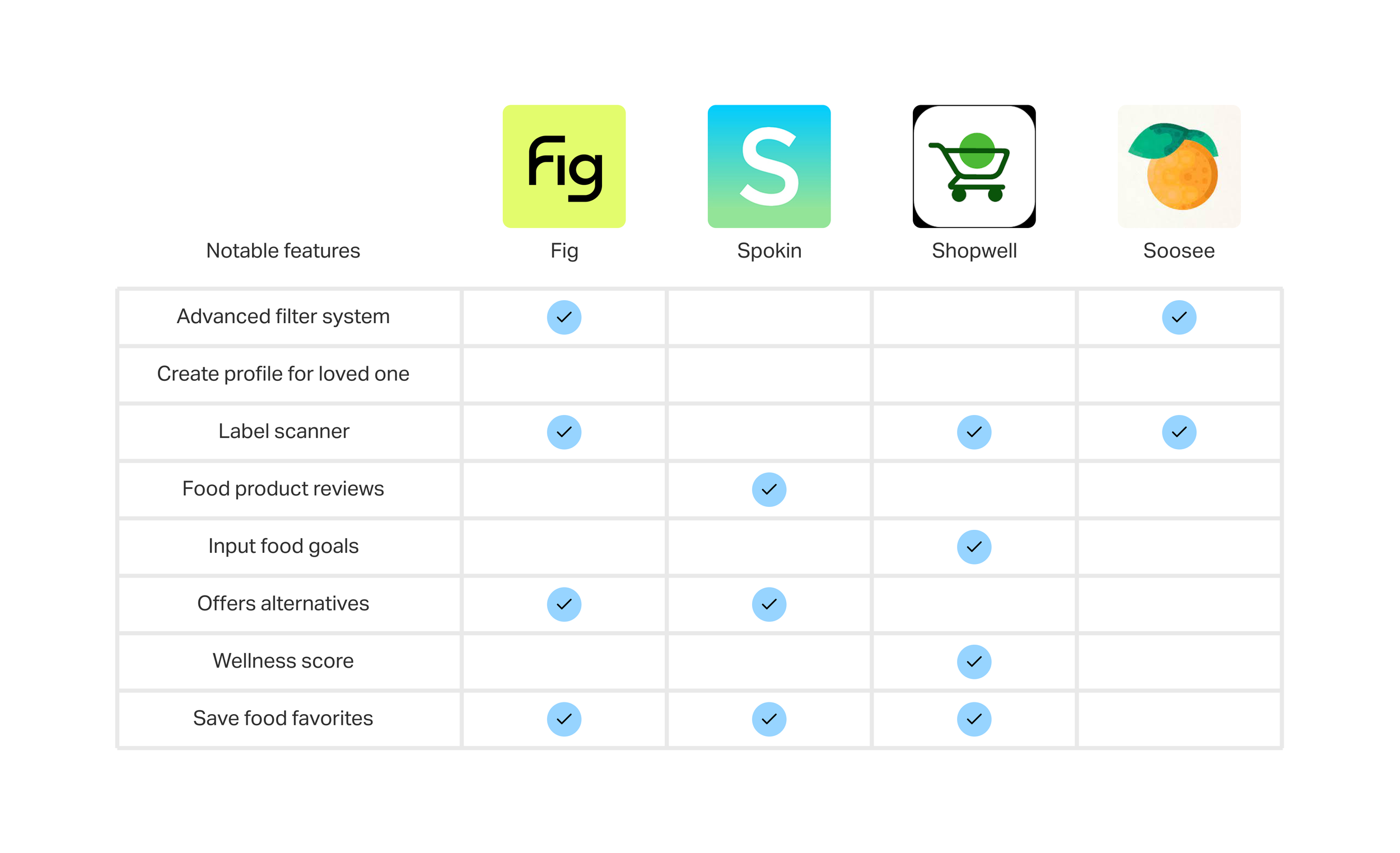
Note: Since the creation of this competitive analysis, Fig ended up launching a feature to create multiple profiles. 
INTERVIEWS
I developed a better understanding of user needs when grocery shopping with a food intolerance
After completing my secondary research, I conducted 5 in-person user interviews. We explored their primary challenges when it came to shopping with food intolerances, their dietary goals, and their methods for verifying food safety. From these interviews emerged several common sentiments:

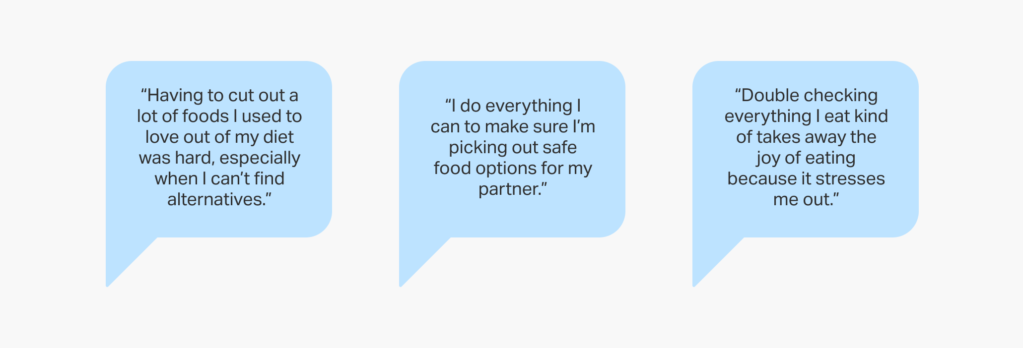

Following an in-depth exploration through 5 user interviews and affinity mapping, the key pain points became very clear. The most common pain points were:
difficulty in analyzing food labels
keeping track of safe food products
complications in shopping for loved ones with dietary restrictions
struggling to find alternatives for unsafe food products in a timely manner

THE PERSONA
Our target user values quick, informed decisions
By developing a clear understanding from our user interviews and affinity mapping, I was able to create a user persona to illustrate major patterns. All users prioritized time-efficient solutions that enable them to make informed decisions promptly, especially in scenarios where it could affect their health or the health of a loved one.


POV AND HMW
Created a framework for my feature set to tackle users' pain points
In order to lay the ground work for my design, I drafted 5 POVs and 12 HMWS. However, 4 HMWs seemed the most promising when it came to sparking ideas for features that would alleviate stress and disorganization for shoppers with dietary restrictions.


FEATURE SET
Prioritized features that alleviate stress and disorganization
Recognizing the importance of aligning the feature set with our target user’s needs and pain points, the focus shifted to the “Must have” and “Nice to have” features that promise a more seamless and personable experience.


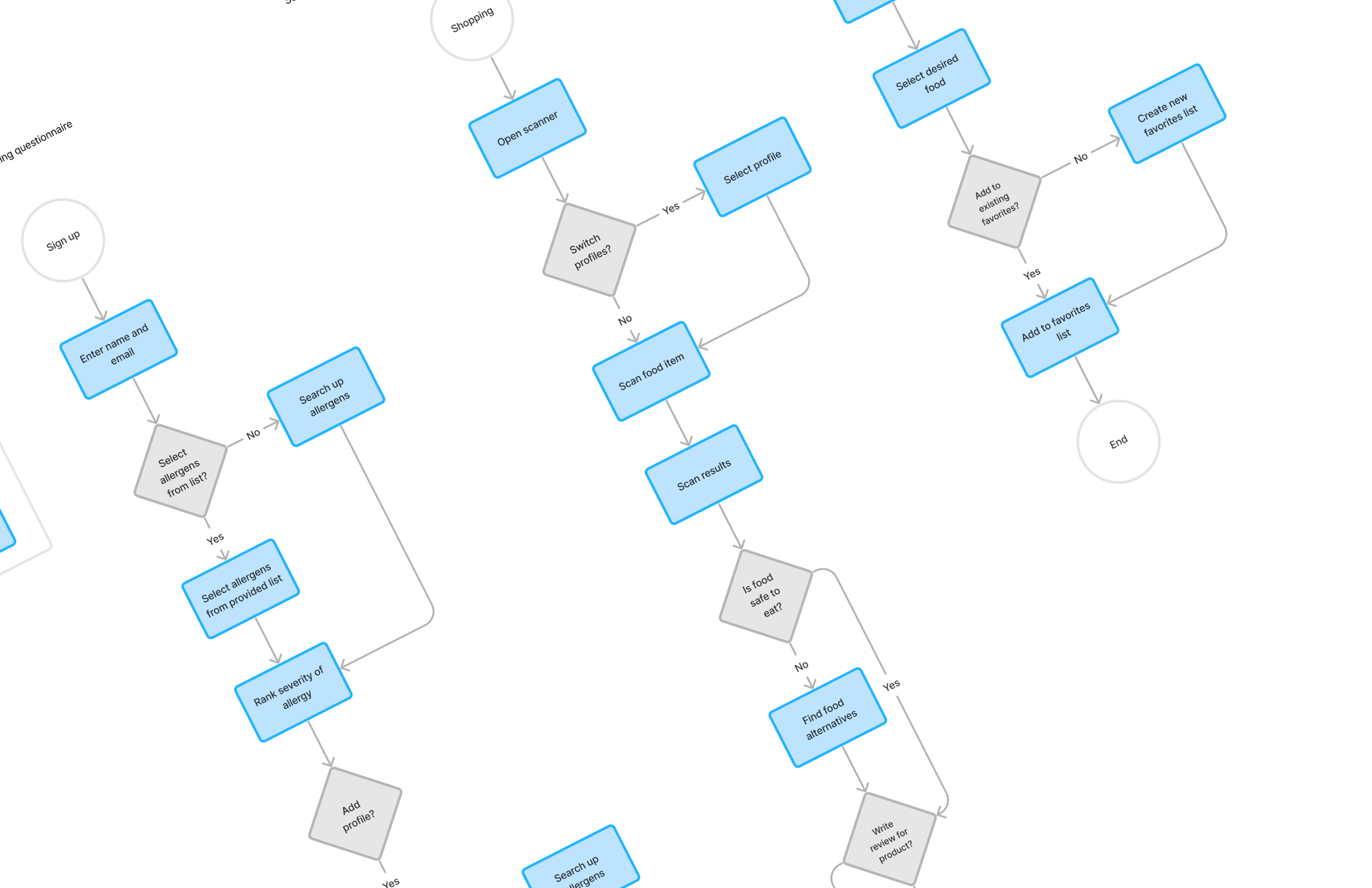
TASK AND USER FLOWS
Ensuring a smooth and timely user experience for food sensitive shoppers
In order to prepare for the design phase, I constructed 3 user and task flows to provide a comprehensive understanding of the steps users would take to guarantee seamlessness when using the new features:
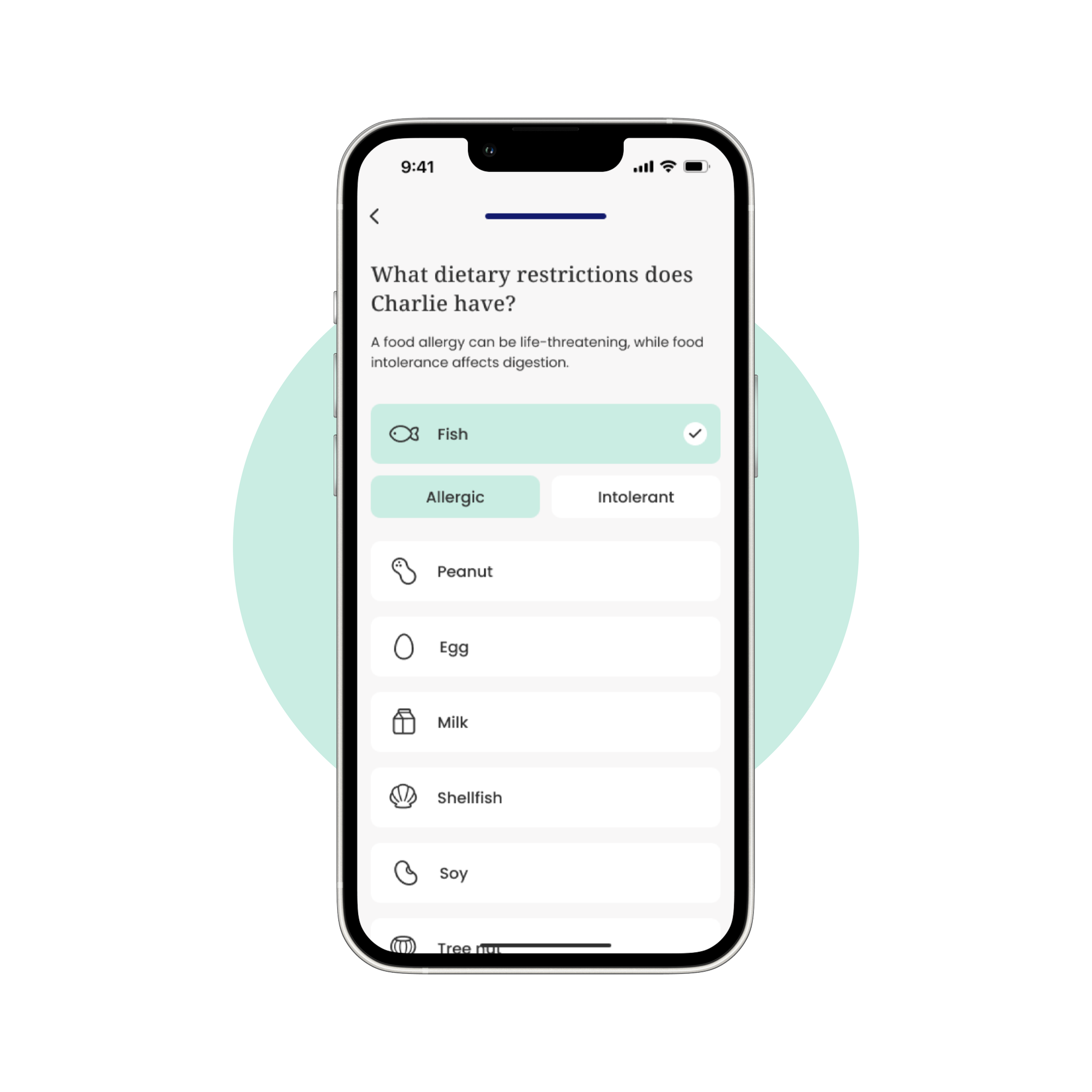
Onboarding questionnaire
Scanning food products to discover alternatives and share a review
Create new favorites list

MID FIDELITY
Getting feedback from the community
Thanks to mentor and peer input, I refined the interface, selected the optimal filter system, and integrated an onboarding blip to differentiate between allergies and intolerances.
Removal of tool tip
Per mentor feedback, integrating the description under the header proved more suitable than using a tooltip.
By having the education blip integrated it also boosted accessibility by preventing thumb fatigue.

Onboarding questionnaire
Clarifying scan results
Removed the store and price filter to lessen cognitive overload and focus more on safety of the food products and switching between profiles.
I provided clarity in regards to which profiles the food product was safe for.
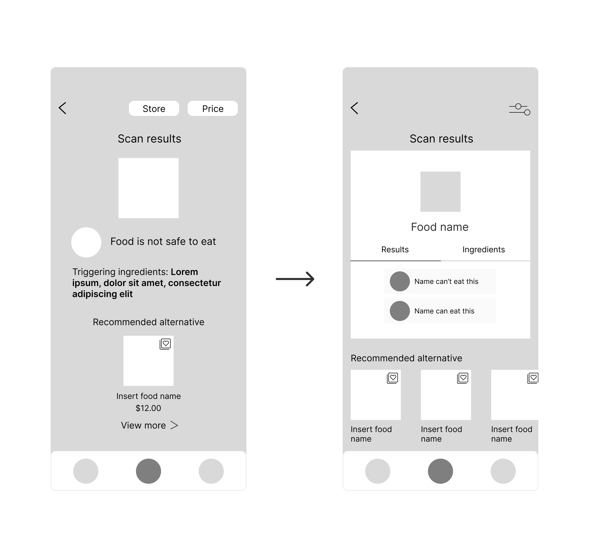
Filter system and scan results page

BRANDING AND UI KIT
I aimed for an approachable and friendly feel, avoiding a clinical vibe
When developing my branding and UI kit, I wanted my product to feel fun and accessible. Many health-related apps can feel clinical and cold, which can intimidate users. I tried to avoid this by using bright colors and bouncy, round emoticons to make users feel comfortable and excited when starting their new journey.

HIGH FIDELITY
To prepare for detailed iterations I finalized my designs for user testing
Shifting into high fidelity, I translated the concepts from my user flows into tangible screens based on my UI kit to prepare for another round of iterations via users testing my prototype.

PROTOTYPE
Looking for opportunities to enhance and elevate my design
Once I highlighted areas of improvement within my mid fidelity-wireframes and applied those revisions to my designs, the stage was now set to move into high-fidelity prototyping in order to test how effective my solutions were.
Onboarding questionnaire
Sign up and create profiles for oneself and a loved one
Select foods or ingredients to avoid, specifying allergies or intolerance
Scan food item and write a review
Scan food labels to check to see if a food is safe to eat
Switch between profiles to see if food is safe to eat for the entire household
Write reviews for food products
Build new favorites list
Search for specific food products
Add products to favorites list
Save to existing favorites list or create a new one

USABILITY TESTING
Usability testing highlighted issues with interface navigation and grasping feature concepts
Once I finished my high-fidelity prototypes, it was now time to put my proposed solutions to the test. I created a plan for moderated in-person testing with 5 participants where I took notes throughout the completion of the assigned flows and asked questions about various design elements. Although all user participants completed the flows, some issues emerged.


100% completion rate
5 participants
In-person testing
ITERATIONS
Users expressed confusion with switching profiles and adding to favorites list
In the third flow, two users clicked the heart icon to add a product to the favorites list. Although this would have yielded the same outcome for completing the flow, I noticed neither of them opted for the "Add to list" button and wanted to make it more clear that it was an option.
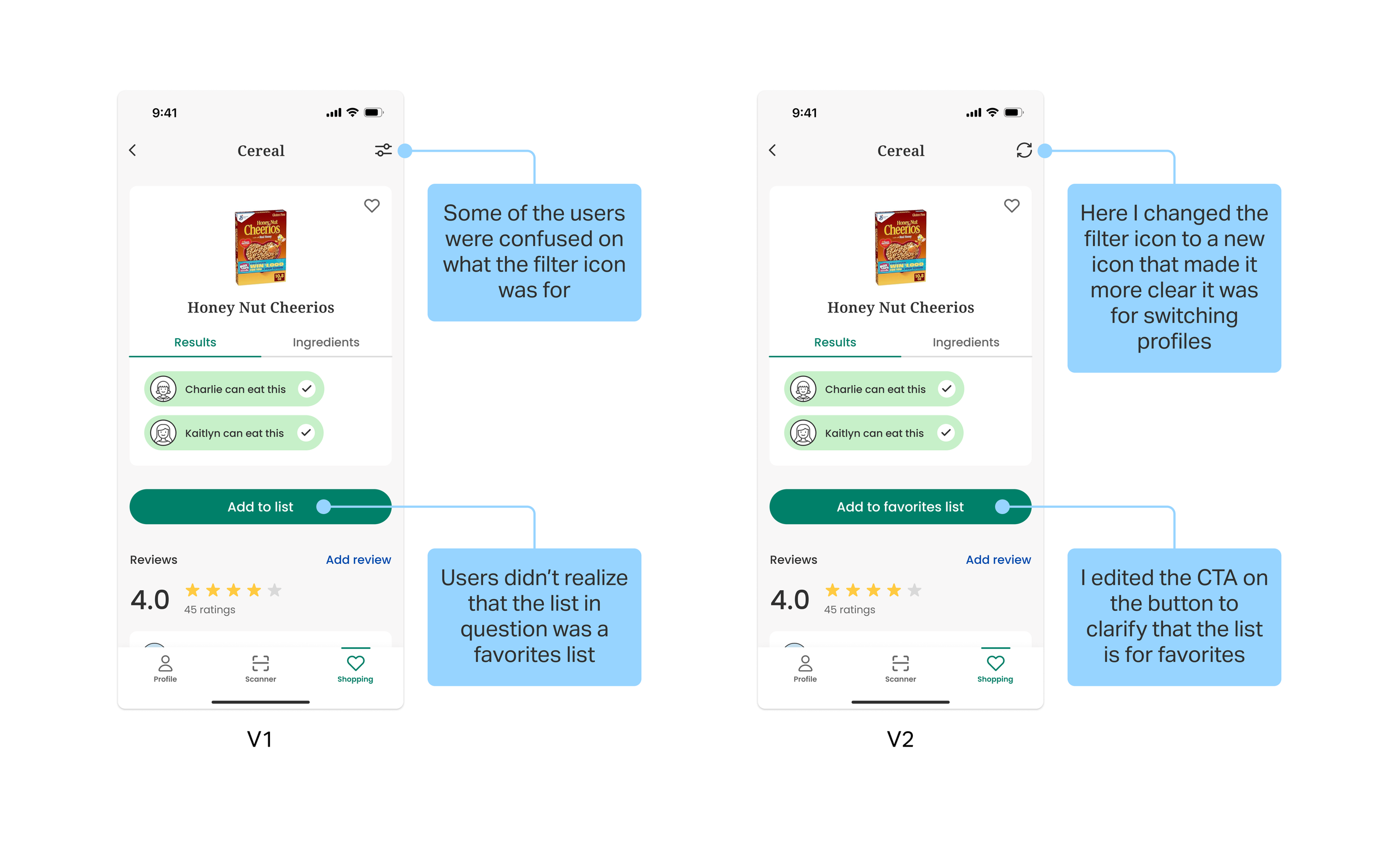
In the second flow, one user misclicked when trying to switch profiles by selecting the profile icon in the bottom nav bar. Another user didn't fully understand the concept of switching profiles.


FINAL THOUGHTS
What I learned along the way
-
The usability testing highlighted the critical role of clarity in design communication. Whether it was in the wording of questions, the placement of interactive elements, or the visual representation of features, clarity emerged as a driving force in enhancing the overall user experience. The challenge lies not only in creating a visually appealing design but also in ensuring that users can easily comprehend and navigate the interface.
-
This case study emphasized the pivotal role of empathy in design. Understanding the emotional aspects of users dealing with food allergies and intolerances underscored the need for a supportive and empathetic design approach. The app not only had to be functional but also provide reassurance and a sense of control for users navigating dietary restrictions.
-
Navigating the intricacies of food allergies while maintaining a simple and intuitive user interface was a delicate balance. Clarifying language, simplifying navigation, and prioritizing essential features became paramount. Maintaining this balance required a constant reassessment of design choices and a commitment to keeping the user experience streamlined.