
DiscoverU Health
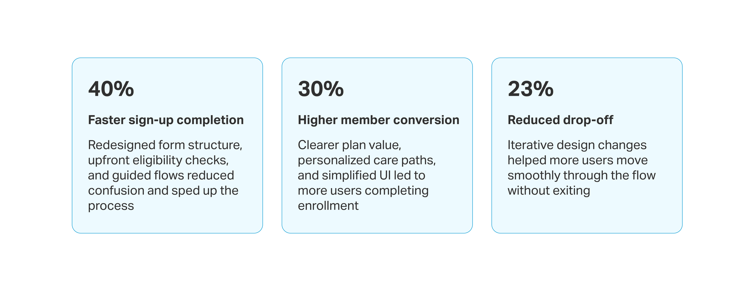
Reimagined the member enrollment process to reduce friction and increase enrollment by 30%


UX/UI designer
Role
12 weeks
Timeline
Member enrollment redesign
Project
OVERVIEW
Streamlining enrollment to reduce drop off
I redesigned DiscoverU Health’s B2C enrollment flow to reduce friction, clarify plans, and highlight the value of concierge care. Working with the co-founder, developers, designers, and healthcare advisors, I helped streamline plan comparison and the overall enrollment experience.
THE PROBLEM
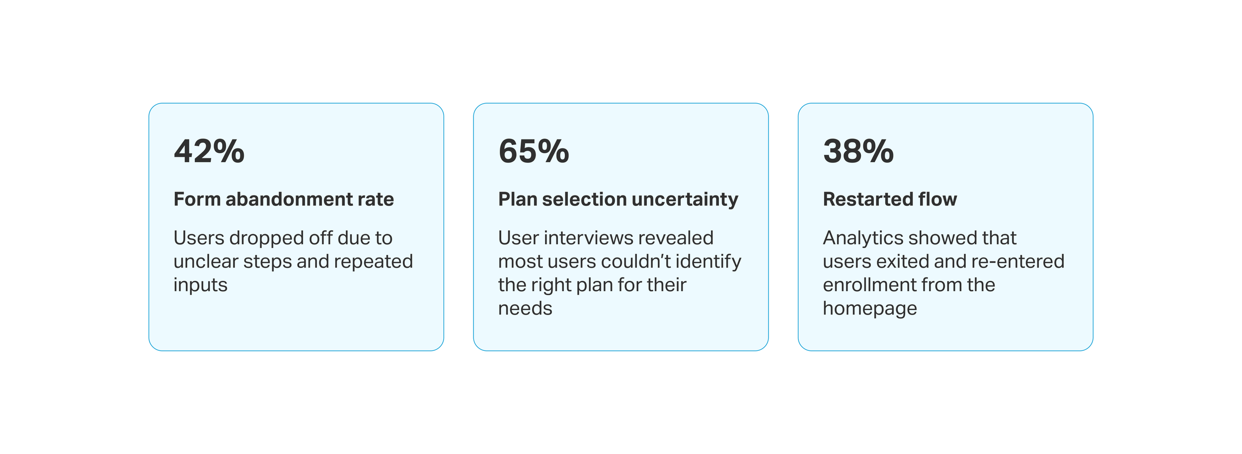
A disjointed enrollment flow and unclear plan options diminished user trust and prevented sign-ups
The enrollment flow lacked structure, users faced unclear inputs, repeated steps, and broken logic across both insured and uninsured paths. Plan pages didn’t clearly explain concierge services or guide users through eligibility, pricing, or value. Flows felt disjointed, and critical information for users above and below 65 was buried or missing.
THE SOLUTION
Reframed care model and plan structure for clarity, relevance, and confident decision-making
I restructured plan tiers by separating core services from add-ons, clarifying labels, and adding a side-by-side comparison with clear pricing. Collaborating with health professionals and the co-founder, we redefined service offerings to help users compare and select the right plan.


Simplified the fragmented enrollment into a clear, guided flow for insured and uninsured users
I redesigned the fragmented form flow by moving insurance selection upfront, splitting complex steps into smaller, logical stages, and showing billing details alongside inputs. This helped users understand their options sooner and reduced errors from backtracking.


IMPACT
My design contributions led to faster sign-ups and higher member enrollments within 3 months of launch
THE PROCESS
Let’s get a closer look
What path did I take to reach my solution? What were some design challenges I faced and how did I overcome them? What were my research findings and what did I learn?
HEURISTIC ANALYSIS
I identified major usability issues in the existing website and enrollment flow
I audited the website and enrollment flow using Nielsen’s 10 usability heuristics, surfacing key issues like unclear CTAs, hard-to-find information, and lack of clarity and clear path for insured vs. uninsured users. The experience was inconsistent and overwhelming, especially for older users and first-time visitors.


UNDERSTANDING THE MARKET
Zocdoc’s segmented enrollment and MyChart’s streamlined experience paved the way for something impactful
I analyzed competitors to understand the user landscape and identify areas for improvement. Besides insurance enrollment, I also focused on benchmark navigation and healthcare positioning. Most competitors lacked clarity around pricing and plan tiers. These insights helped shape a more transparent and personalized experience for DiscoverU Health members.

USER INTERVIEWS
Interviews revealed gaps in trust, missing plan context, and uncertainty around pricing and eligibility
I conducted 5 user interviews to understand why users hesitated to trust or complete the enrollment process. Users felt confused by unclear guidance, repetitive steps, and lack of clarity around what their plans included—especially when navigating coverage with or without insurance.

DESIGN OPPORTUNITIES
To turn research into action, I prioritized and categorized insights to guide design decisions
To synthesize research findings, I grouped recurring usability issues into actionable insights and framed design opportunities as “How might we” questions. This helped align the team around clear problem areas and set the direction for solution exploration.


DESIGN OPPORTUNITY 1
How might we personalize the flow based on insurance status to reduce friction and show relevant plan options?
USER FLOWS
Streamlined enrollment to adapt by age and coverage, guiding users to the right path
The original enrollment flow treated all users the same, regardless of age or insurance coverage. This led to confusion, drop-offs, and misaligned care selection, especially for users above 65 with Medicare.

I streamlined the enrollment flow for under 65 and 65+ users by:
Breaking down complex steps into simpler, guided stages.
Adapting the flow based on insured or uninsured paths.
Including early insurance validation and plan re-selection when needed.
Offering care-setting options (virtual or home-based) for clarity and relevance.


DESIGN SOLUTION
Tailored enrollment path for 65+ users
While both flows shared core design improvements, the 65+ user flow included specific additions such as:
Highlighted recommended add-ons based on Medicare, Medicaid, or private insurance
Home-based and virtual care options before payment to set clear care expectations upfront
Kept selected plan and pricing visible throughout the flow for clarity and context
Progressive disclosure with clear labels to simplify the process and keep users informed
DESIGN OPPORTUNITY 2
How might we implement upfront insurance checks to guide users to the correct plan flow and lessen confusion?
USABILITY TESTING
I validated early layout concepts with users to improve the insurance flow
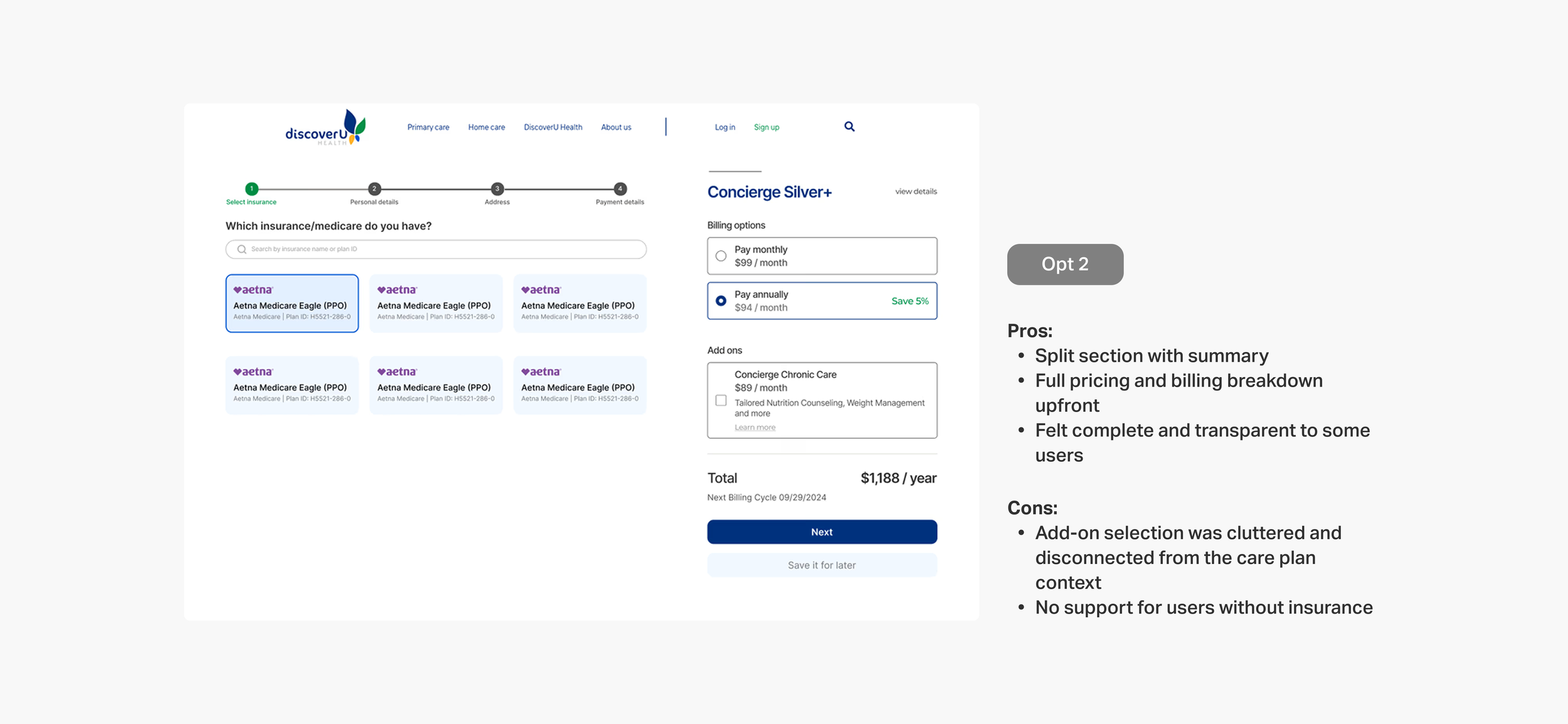
To test how users understood eligibility and uninsured plan selection, I conducted rapid concept testing using clickable prototypes. I compared 3 layout variations with 6 participants to evaluate clarity, decision confidence, and ease of navigation. Insights from this helped inform the final direction and reduce user friction.


DESIGN SOLUTION
Checking insurance status upfront to guide users to the right plan
I redesigned the flow to collect insurance details, provider, ID, and DOB, at the start. This allowed the system to validate eligibility early and guide users into the right flow (insured or uninsured), reducing friction and improving plan clarity:
Captured provider name, ID, and DOB early to validate coverage before next steps
Redirected users with invalid insurance to relevant plan options
Grouped key inputs fields to reduce backtracking and confusion
DESIGN OPPORTUNITY 3
How might we make plan coverage and add-ons more transparent to support confident decision-making?
STAKEHOLDER DISCUSSIONS
I restructured the care plans’ layout to clarify insurance coverage and highlight what’s included in their selected plan
To reduce confusion and align care offerings with real user needs, I collaborated with the co-founder and healthcare professionals to redefine plan tiers, clarify add-on services, and segment offerings by coverage type and age. This work laid the foundation for a more trustworthy, relevant enrollment experience


DESIGN SOLUTION
Simplifying plan selection to support confident decisions
After aligning with stakeholders on which services belonged in DiscoverU Health’s core offerings, I redesigned the plan layout to highlight coverage differences and make pricing more transparent. I also integrated it directly into the enrollment flow, allowing users to confidently revisit and update their concierge plan mid-way without losing context
Let users switch plans mid-way during enrollment without losing progress
Enabled quick toggle between monthly and yearly pricing for easier cost comparison
Added ‘View Benefits’ link in the order summary to let users revisit offered services
DEVELOPER HANDOFF
I created mobile-responsive designs and WordPress-ready files for seamless implementation
I delivered fully functional, developer-friendly web and mobile designs compatible with WordPress CMS, ensuring easy implementation. The design elements were optimized for smooth integration, with reusable components and detailed guidelines for the development team to maintain consistency in layout, typography, and responsive behavior
REFLECTION
Unpacking what I learned
-
Designing for an older audience required empathy and careful consideration, as they engage with technology differently. We simplified navigation, reduced complex steps, and ensured actions were clear and easy to follow. By making buttons and clickable elements appropriately sized, we reduced frustration and improved usability for users 65+.
-
Digging into why users weren’t enrolling revealed more than just surface-level UI issues. Through interviews and usability testing, we uncovered deeper challenges with messaging, overwhelming flow structure, and a lack of guidance. These insights shaped more intentional design decisions, helping us address user hesitations at the root—not just the symptom.
-
Balancing user needs with business goals was crucial in this project. The CEO had specific expectations about which services we were offering and how the information needed to be presented, but we also had to make sure the design communicated these offerings clearly and aligned with our brand voice. This meant we had to find a way to make the services not only understandable and appealing to users but also true to the company's strategic goals, ensuring both functionality and value for the business.


